
Step-by-step guide on how to user Flexbox in CSS and frontend web development. Learn Flexbox in minutes.
Flexbox, named also flexible box, is a new layout mode introduced in CSS3, which defines how elements are arranged in a page in a way that they behave predictably under different screen sizes and devices.
It is called flexbox because of its high flexibility on controlling the behaviour of elements in various directions. Compared to the old layout methods like display table and floating inline blocks, it is much easier and more flexible to:
Flexbox is wonderful for scaling, aligning and re-ordering elements. But try to avoid using flexbox for:
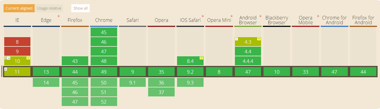
Browser support of flexbox. Captured from CanIUse (http://caniuse.com/#search=flex)
Most old browsers, like IE8 or below, do not support or only partially support flexbox. If you want to play safe, you should fall back to old css, for example display: inline-block with float and display: table.
However if your only target on modern browsers such as chrome, firefox, Safari, IE 10+ or Edge, then it is definitely worth giving a try.
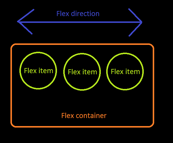
In a flexbox model, there are:
Humans learn from experience and examples. So let's start!
<div class="flex-container">
<div class="flex-item"></div>
<div class="flex-item"></div>
</div>
.flex-container {
display: flex;
}
In order to define a container as flex container, only display: flex is needed. Without setting any extra rule, all direct children are considered as flex items which are laid horizontally from left to right in the same row. If total width of flex items are greater than the container, they will be scaled down so that they all can just fit into the container.
.flex-container {
display: flex;
flex-direction: column;
}
Flex items can be laid vertically by setting flex-direction: column. It is also possible to lay them in reverse order by setting to flex-direction: column-reverse or flex-direction: row-reverse.
.flex-container {
display: flex;
flex-direction: column-reverse;
}
.flex-container {
display: flex;
justify-content: flex-end;
}
Recall that there is flex direction for every flexbox model. justify-content is defining where the flex items should be placed along the flex direction. In the example, justify-content: flex-end means items are put to the end of the flex container in horizontal direction. That’s why they are placed to the right.
.flex-container {
display: flex;
justify-content: center;
}
It is trivial to center align flex items along the flex direction.
.flex-container {
display: flex;
justify-content: space-between;
}
Flex items are spread out similarly to justify-content: space-between. However there will be space for the starting edge and ending edge of the flex container. The width will be half of that between 2 adjacent flex items.
.flex-container {
display: flex;
justify-content: center;
align-items: center;
}
Usually, we would like to lay elements along the flex direction and at the same time, align flex items in other direction perpendicular to flex direction. By setting justify-content: center and align-items: center, flex items can be placed at the center of flex container both horizontally and vertically.
.flex-container {
display: flex;
align-items: center;
}
.flex-bottom {
align-self: flex-end;
}
Note that besides specifying the way of alignment in flex container, it is also possible to align a particular flex item differently by putting “align-self”.
.flex-container {
display: flex;
flex-wrap: wrap;
}
By default, flex items are not allowed to wrap and they are resized to fit into one row or column if flex container is not large enough. By putting flex-wrap: wrap, flex items which are causing overflow will then be wrapped to another line.
.flex-container {
display: flex;
flex-wrap: wrap-reverse;
}
Flex items are still laid in multiple lines as flex-wrap: wrap-reverse. However the lines start from the end of flex container.
.flex-container {
display: flex;
flex-wrap: wrap;
align-content: flex-start;
}
By default, wrapped lines of flex items are stretch to take up all remaining space with equal spacing between 2 adjacent lines. You can set align-content to the flex container to determine the positioning of elements when there is wrapping. Possible values are flex-start, flex-end, center, space-between, space-around and stretch (default value)
.flex-container {
display: flex;
}
.flex-item.nth-of-type(1){
flex-grow: 1;
}
.flex-item.nth-of-type(2) {
flex-grow: 2;
}
flex-grow takes effect only when there is remaining space in a flex container. flex-grow of a flex item is the ratio of container's remaining width/height that the item takes to fit exactly the container's size. Default is set to be 1. When being set to 0, the flex item will take 0% of the remaining space, meaning it will not grow at all. In this example, the ratio is 1:2, meaning the first item will take up ⅓, while the second item will take ⅔ of the space left.
.flex-container {
display: flex;
}
.flex-item:nth-of-type(1) {
flex-shrink: 1;
}
.flex-item:nth-of-type(2) {
flex-shrink: 2;
}
flex-shrink only takes effect when the flex items overflow the flex container because of insufficient space. It is the ratio of overflowed width/height that the item will reduce to fit exactly the container's size. When being set to 0, the flex item will reduce 0% of the overflowed space, meaning it will not shrink at all. In this example, the ratio is 1:2, meaning the first item will reduce ⅓, while the second item will reduce ⅔ of the extra space.
.flex-container {
display: flex;
}
.flex-item.nth-of-type(1) {
flex-basis: 200px;
}
.flex-item.nth-of-type(2) {
flex-basis: 10%;
}
Instead of using the initial size of an element, you can customize its size with flex-basis. By default the value is flex-basis: auto, in this case the initial size calculated from non-flexbox css rules are used. You can also set it to some absolute value and percentage value with respect to the flex container, for example flex-basis: 200px and flex-basis: 10%.
.flex-container {
display: flex;
}
.flex-item:nth-of-type(1) {
flex: 1 0 100px;
}
.flex-item:nth-of-type(2) {
flex: 2 0 10%;
}
flex is a shorthand for flex-grow, flex-shrink and flex-basis. In this example, the first flex item is set to be flex-grow=1, flex-shrink=0, flex-basis=100px and the second flex item is set to be flex-grow=2, flex-shrink=0, flex-basis=10%. Since there is remaining space for the flex container, only flex-grow takes effects and flew-shrink is ignored.
Flexbox is easy to learn and manipulate. This is very essential especially when nowadays web development cycle is usually short and rapid. If you are not confident enough and want to play around with flexbox, you may visit Flexyboxes and Flexbox Froggy to try out more. You can also read more on css trick: A guide to flexbox and w3c: CSS Flexible Box.


